Whilst I was in London, I went to the wonderful L Cornelisson & Son, the most amazing art supplies shop in the city, to pick up some ink and ask advice about calligraphy pens. I’ve always wanted to do calligraphy, but being left-handed has posed some problems. Because of how I hold a pen, so-called ‘left-handed’ pens don’t work for me – I’m still pushing the nib across the page so it digs in and the slant to the tip is all wrong.
There are, however, oblique nib holders that are supposed to fix that problem, but I didn’t know if they would fix that problem for me. So it was nice to be able to go into L Cornelisson & Son, ask some advice, try the oblique holder, and pick some nibs to play with along with some nice ink.
I bought four nibs: a pointed nib, two left-handed italic nibs, and one that gives a double line. Having played with all four yesterday, I have decided to focus on the pointed nib and the English round hand style of writing, which includes Copperplate. I had thought about going the Blackletter (Gothic) route with the italic nibs, but found it a bit harder to get the italic nibs to behave nicely with my particular way of writing.
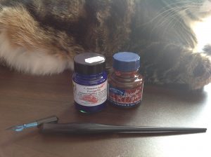
My supplies are a pointed nib, oblique holder, C Robeson & Co Penman Ink in Prussian Blue, and Windsor & Newton Calligraphy Ink in Indian Red, all displayed by my assistant, Grabbity.
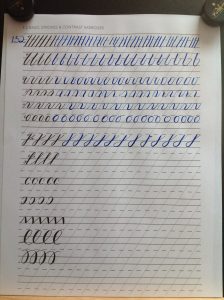
I downloaded and printed out a worksheet, set it up on my writing slope (set at a low angle), and gave it a go.
The lines are a little wobbly primarily because one is not supposed to lean one’s wrist on the slope; instead, all motion should come from the shoulder. Well, that’s fine and good but my shoulder was not particularly excited by the idea of doing all that work. It’s going to take while to build the muscles up, to be honest.
However, I was relatively happy with this first stab, and am delighted with the Prussian blue ink. It’s just gorgeous!
{ Comments on this entry are closed }


