There’s a lot of advice on how to design book covers floating around the internet. Lots of it is very sensible: Your book cover should reflect the genre and cleave to its tropes. It should reflect the tone of your story, communicating to potential readers what they are getting before they even open the book. The text should be readable in thumbnail, so that it shows up well in Amazon, but it also needs to look good full-size in print. Plus it needs to work in black and white, or rather, the dark grey and light grey of eInk ereaders. What you’ll rarely hear is “And it need to look good when foil-blocked on to French silk bookcloth”.
Argleton is a short novella, possibly even a novelette. It is too short to print via services like Lulu without ending up with a lot of blank pages at the back or using very big type. The only way it will find itself in print again is if I do another and hand bound edition, so any cover I have for the book has to work well in that context.
Hand binding a book brings with it certain constraints, particularly if you are working with a minimum of equipment. For example, having strong, bold horizontal or vertical lines are a mistake, because then you have to make sure that everything is lined up perfectly. That can be done, but I’m a perfectionist and even if the book came out even a tiny bit skew it would drive me up the wall.
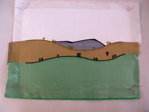
You also have to think about how you are going to transfer the design to the book. When I did the first edition of Argleton, I did one version with a paper cover, and one with a hand-sewn silk cover. I don’t think I’d do either again now. The paper cover was a pain in the arse to work with, and the hand-sewn silk cover took forever to put together – four separate pieces of silk that had to be bonded together then embroidered. Each one took about 20 hours to complete.
Instead, future books will be foil blocked, ie the design is stamped on to the cover using a hot block and a metallic foil. Foil blocking looks gorgeous and I’m hoping to be able to find a small table-top machine that I can use at home to do this.
Now, I could have had two designs done for each novella – one for the ebook and one for the hand-bound book – but I didn’t want to pay for two covers for a book that is no longer really selling and I didn’t want to dilute the book’s brand. So one cover has to do double duty as best it can.
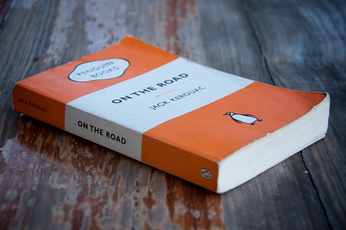
When I was talking to my designer, Thomas James, about what I wanted, it wasn’t just the constraints provided by the foil blocking that I had in mind. I also wanted a cover design that was typographically and graphically strong, something that looked a bit different to the usual ebook fare and would stick in people’s minds. For me, the key inspiration was the classic Penguin paperback design:
I also wanted a design that would grow as my own catalogue grew, with each addition of a new book adding more depth to the overall feel of the others. If you had these books lined up next to one another on your bookshelf, they should speak to one another in warm and kindly tones, they should look like they belong together, each bringing out the best in the other.
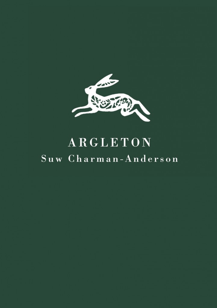
The design that Thomas did for Argleton was beautiful, featuring a gorgeous hare that I would just love to one day turn into a necklace:
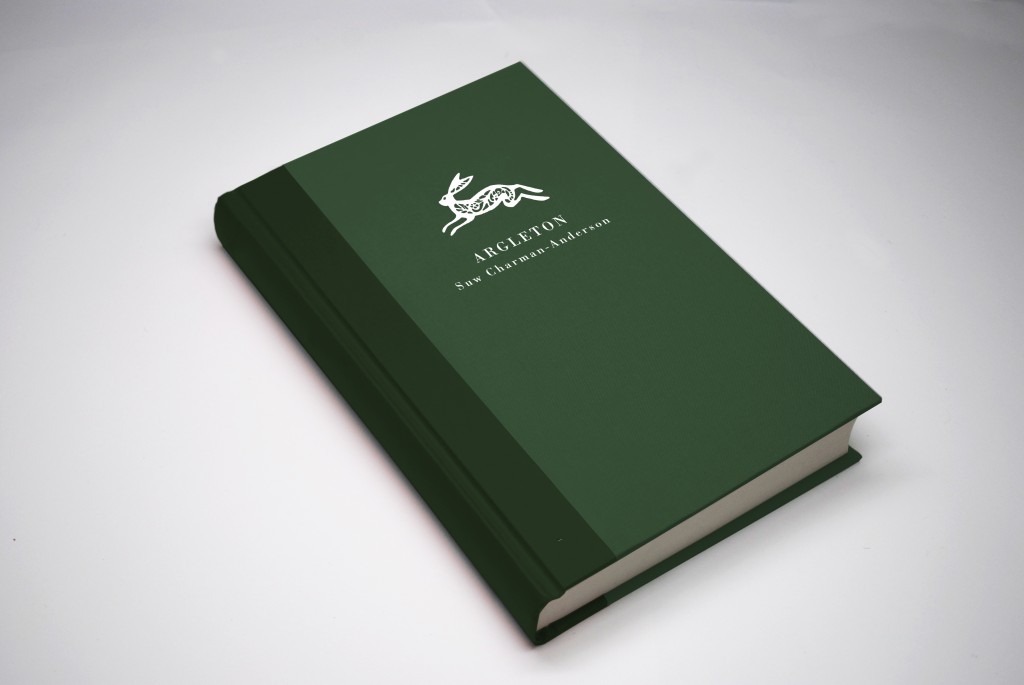
If Argleton does ever get a second edition, this is roughly what it would look like (though smaller and slimmer – it’s just not that long of a book!):
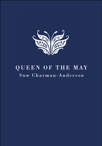
When it came to Queen of the May, I wanted to Thomas to work exactly the same magic, and he did. The design is based on an angrek, Angraecum magdalenae, a rare orchid that features in the story.
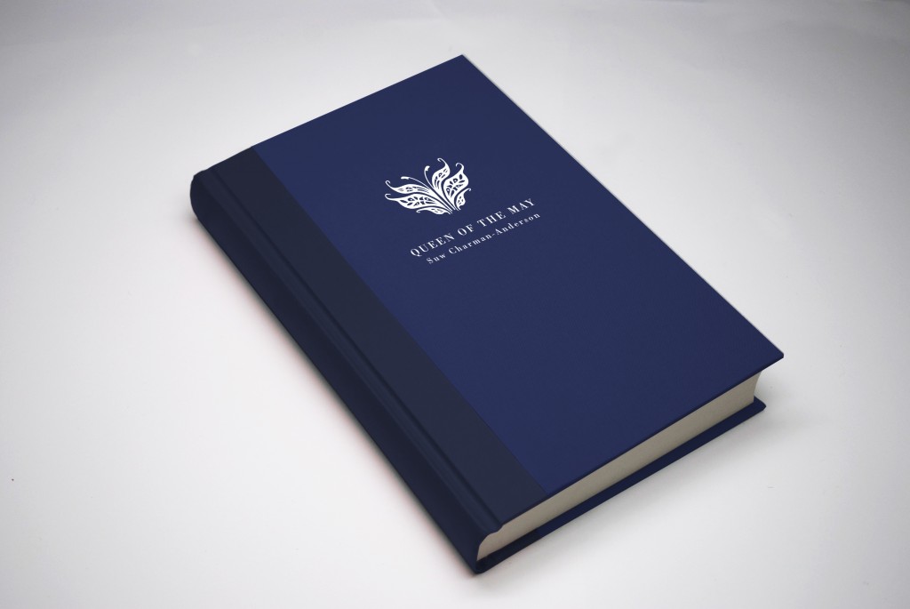
And again, the mock-up for the hand-bound book:
The chances of Queen of the May making it into print are reasonable. If there’s a good response to the ebook and I can get enough people interested in a print version, then I’ll run the Kickstarter that I was planning earlier in the year, though I may well strip it right back to basics so that it doesn’t become a massive time sink. (If you are interested, then subscribe to my monthly newsletter to make sure you don’t miss out on any news!)
Even without the print versions, I think the strong visual design and typography makes these covers work exactly as I had hoped they would. They don’t say much about the genre that I’m writing in, which is fine because I’m not even sure what genre that is. They don’t tell you much about the story that you’re getting either. But they do gives you a sense of identity, an idea of their sensibilities. I can’t wait to get my next novella finished so that I can see how the third design fits in with and speaks to the others.
Argleton and Queen of the May are available via my ebook store.



I’ve been a strict eBooker for a while now but after seeing this I would love town these as real books. If this is how they will look then I’ll be up for the Kickstarter.
By the way, I’m enjoying Queen of May … just about to start Chapter 14.
Thanks Scott! I’d love to be able to create these as real books too, so hoping that later in the year it’ll become possible. Right now, I’m horribly over-committed, but perhaps after Ada Lovelace Day (15 Oct) is done, things will ease up a bit!
And I’m glad you’re enjoying the ebook! Hope you continue to do so!
Comments on this entry are closed.