A while ago I stumbled on this post from Eric Hellman exploring the question of what sort of front- and endmatter makes sense for ebooks, given that many of the pages that we see in the front of paper books have a purpose related to the printing process. Says Hellman:
A good example is the bastard title (or half title) page. This a page, usually printed with only the book’s title, that precedes the title page in the book. When dinosaurs roamed the earth, the function of the bastard title was to identify and physically protect the paper text block until it was bound. Sort of like the tissue paper they still put in fancy wedding invitations. I daresay that ebooks do not require any such protection. It is utterly without use in an ebook. Begone!
Next, consider the title page. It typically displays the books title, author, and the publisher.
In a print book, the title page is a declaration of bookiness. You don’t have title pages in magazines or newspapers. The title page says “get, ready, here comes a book, so go find a comfy chair.”
But a digital book needs something different. It needs a start page. Think about the start screen of a DVD. (You DO remember those, don’t you?) Now think a bit more generally. Modern ebooks share their underlying technology with websites, so why not convert the title page of a book into a home page for the book, with the sort of utilities you expect on a home page?
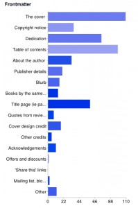
That got me to thinking, which then got me to asking questions on Twitter, and finally, to setting up a wee questionnaire. Rather than try to guess what people might want, I thought it was easier to just ask them, and 137 people gave me their opinions. The results were in some ways surprising. But first, the not so surprising bits.
For the front matter, people mainly want to see the cover, dedication and table of contents. Several people on Twitter made the point that the Kindle dumps you in at the first page of text, meaning that you then miss out on seeing the cover, so a link to it in the table of contents to the cover is actually rather useful.
Although people aren’t massively keen on seeing a copyright notice, I think it’s only fair to tell people what they’re getting up front, so I personally think that should be retained. And the title page, which Hellman suggests could be replaced by a ‘start’ page, got a pretty good response despite the fact that it serves no real purpose in an ebook.
Perhaps it’s just that a title page is for many people a key part of the visual language of the book, it’s comforting and expected. That ‘declaration of bookiness’ is still important, so whilst removing it might make logical sense, does it make emotional sense?
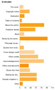
For endmatter, people wanted to know about the author, find other books by the same author, see acknowledgements and other credits, get information about the author’s mailings list, blog etc., as well as get sample chapters of other books.
Interestingly, some of the stuff that an author’s ego might be tempted to include scored very badly, such as the blurb and quotes from reviews, and there was little interest in offers and discounts. I’m surprised by the latter, to be honest. Who doesn’t like a bargain? Book readers, apparently.
After some really vehement reactions about ‘share this’ links on Twitter, I asked specifically for people’s reaction to them. What did they think of them? What I got was, well, interesting and, again, a bit surprising.
Yes, some people said that they appreciated ‘share this’ links, and a lot of people said they were non-plussed by them or ignored them, but others were quite vocal in their objections. Here are some of the positive responses:
“I think they’re fine. I like to share things I like with friends.”
“I like the idea of sharing what I’m reading with my friends/followers.”
“Just seems natural to me.”
And some of the, erm, less positive responses:
“I’m trying to read. Leave me alone!”
“Really irritates me. Naked attempt at marketing, very offputting. If a book is good I wont need reminding to word of mouth it.”
“I find them annoying”
“an irritating page to be clicked past – I have no desire to share my reading habits with others”
“Yuk…”
“I don’t getting social points for what I’m reading, but I don’t want to be seen as *seeking* social points for what I’m reading. So screw you, “Share this” links.”
“Don’t use them – I find them intrusive.”
“Get annoyed and ignore it.”
“I think ‘not fucking likely’.”
“HATE, HATE, HATE them. I don’t “share” every minute of my time on FB or twitter, and resent the assumption that I might want to.”
“I find it extremely irritating – I have no desire nor need to ‘share’ everything I buy with everyone I know or might know!”
“I think OH MY GOD AM I ALLOWED A SINGLE THING IN MY LIFE THAT ISN’T CONNECTED TO BLOODY FACEBOOK AND TWITTER?!”
“If I like a book I’m more than capable of typing the title and author name in myself to recommend it to others- and if you use the “share this” button people can always tell when its a prewritten message.”
“Basically, these links are a bad thing, probably the worst thing about ebooks from a reader’s point of view, and I am against them.”
Although many were entirely unbothered by ‘share this’ links, the intensity of emotion amongst those who disliked them was so fierce that I think it’s just not worth risking antagonising readers by including them. If someone’s taken the trouble to read my book, the last thing I want to do is accidentally leave them with a sour taste in their mouth. If they want to share it, then they will, and they’ll do it however they wish, whenever they wish.
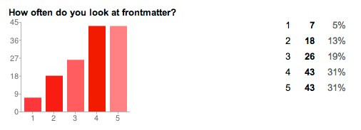
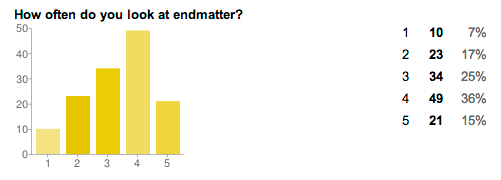
Finally, I asked people whether they actually read front- and endmatter, with 1 being ‘never’ and 5 being ‘always’:
I’m actually quite surprised that people mostly do read front- and endmatter, so the question of what to include really is worth carefully considering.
I think I’m starting to get a standard set of front- and endmatter that ticks the right boxes for me and hopefully for my readers too. But the nice thing about ebooks is that they are easy to change and I’m still interested in people’s opinions, so please do leave a comment!



This post is mind opening thank you. Will take on board for next snooker.
one thing about twitter/facebook links are that they will probably date very badly. Can you imagine a 2004 book with a myspace link it? would that link even work?
Some form of “tell your friends” suggestion may go down better.
Interesting stuff. I know I get irrationally annoyed when I download a book and it throws me straight in at the first page. I always like to see the cover first for some daft reason.
At the back, maybe we should take the DVD route and have an “Extras” chapter for all the bits and bobs.
Very interesting and nice research. I am also of the “Love the title page” although I think I really like the cover just as much and am a bit sad when ebooks don’t have covers, especially when there is a paper version that does.
I suspect that feelings on the title page/cover may change over time as I think some of the reaction is part of the “experience” which for the current crowd of readers initially came from paper books which had all of these features. As paper books stop being the majority of people’s experience they may feel less connected to the title page and be fine with the fact that many readers drop you to the first page of the book.
My reading of front matter has changed over time – I used to just skip it but now I like reading the before stuff and seeing what inspired the writer.
On the links to the outside world front – I can see how they could engender a strong negative reaction – if a book is where you get away from everyone you don’t really want to be bothered about “tweeting this” it breaks the immersion.
That said – I wonder if my reader (one that types reasonably) let me connect to my goodreads accout (for example) if I would want the option on reaching the end of the book (or by pressing a button that is on the same row as “go to table of contents” to update my goodreads account and write a review. That would be after the experience and while the book is fresh in my mind.
I once started to read an ebook that had ten (I counted ’em in gobsmackedness) pages of blurbs and quotes before I even got to the title page! The only reason I continued reading after that was because it was in a series that I was enjoying.
All I want at the front of a book, of any sort is the cover art and title page. The rest I’m happy to browse through once I’ve finished reading. ie at the END of the book.
The ‘extras’ chapter and links etc is a great idea!
I have a book on my Nook with 27 pages of guff at the front… 27!!
Thanks! I think that the idea of connecting to Goodreads or other such options would be good to do at a device level, rather than per book, with sharing enabled or disabled in settings. That would give people an overall option about what they want to do and take the onus off the author/publisher to include that sort of info. I can’t see any reason why it should have to be done book by book, tbh, other than the ebook reader creators haven’t, on the whole, thought about this stuff. Kobo may be the exception – they have quite a bit of social stuff built into their readers.
Very good point about how links age badly. Easy to update them if you only have a few books, but would be tough on a massive catalogue.
Hi Suw, a fantastic post. There was a discussion on ALLi FB page that the front matter should have a brief blurb about the book. The argument was that when you buy a paper copy, you can read the sleeve or back page to find out what the book is about. E-book buyers often buy in bulk (or when offers are on), and often there a long time lag between purchase and read. So it’d be useful to know what the book was about when you come to read it. This is on my ‘to do’ list.
Great blog!
Helena
PS. One my books is titled Coffee and Vodka – great minds?
Thanks for the comment, Helena. I think there might be interesting divisions between hardcore ebook buyers/readers, and your run-off-the-mill sorts, that buy books only that they want to read rather than speculatively. For the latter, a blurb at the front only tells them what they already know. For the former, a blurb at the front could be useful information. But I suspect the hardcore buyers are a minority, though it’d be interesting to see evidence (which I don’t have!).
Oh, and all great minds appreciate vodka. 😉
Hi
I’d be interested to know if for non-fiction books if glossaries were still appreciated or not?
Best
Heather
Hi Heather. Unfortunately, I didn’t ask about non-fiction book endmatter. I think that’d be another good survey to do, though.
Very interesting research. Thanks for sharing.
I’ve been missing the cover art on my Kindle too.
I have a novel coming up in paper and as an e-book soon. Your findings will really help.
I would eliminate the “praise” section. In a paper book that you are considering at a bookstore you might be influenced if a book reviewer or another author says that the book is wonderful. For an eBook, you have to buy the book before you can see the praise. Therefore, I think that the praise section serves no purpose.
What I would like to see added is better metadata, including a plot synopsis, character names, character occupations, location names, tags, series (if any) book number in the series, etc. In an eBook universe, people are never going to purge their libraries. Finding a book that you remember from many years ago will become more and more difficult.
The mention of a brief blurb about the book in the front matter gave me pause.
I always include the cover embedded as the first page of my ebooks just in case the vendor (or e-reader) doesn’t display the actual cover itself. Sometimes folks get two covers that way, which is quickly resolved by clicking the next page.
Perhaps on the next ebook I format, I’ll include the back cover as well, which will not only provide the story description, but continue the artwork from the front.
Thanks so much for your analyis. I always struggle with how much front matter to include, and recently started moving the Table of Contents to the end of the book just to unclutter the front end. Now I’m thinking I’ll put it back…
Interesting post, thank you very much! eBooks are still very much a byproduct of its physical counter part. Maybe the front- and endmatter will improve when we start designing for eBook rather then converting to eBook.
Comments on this entry are closed.